This project designs a desktop dashboard to help users track key health data—like blood glucose, sleep, calories, waist size, and blood pressure—to manage type 2 diabetes and its risks. The goal is an intuitive, data-driven interface that supports healthy decisions.
About the project
This project designs a desktop dashboard to help users track key health data—like blood glucose, sleep, calories, waist size, and blood pressure—to manage type 2 diabetes and its risks. The goal is an intuitive, data-driven interface that supports healthy decisions.
About the project
This project designs a desktop dashboard to help users track key health data—like blood glucose, sleep, calories, waist size, and blood pressure—to manage type 2 diabetes and its risks. The goal is an intuitive, data-driven interface that supports healthy decisions.
Core Problem & Solution
🧩 Core Problem
People living with type 2 diabetes often face challenges when trying to make sense of their health data. Existing apps can feel cluttered, overly clinical, or too technical — making it hard to stay motivated and see progress clearly.
💡Our Solution
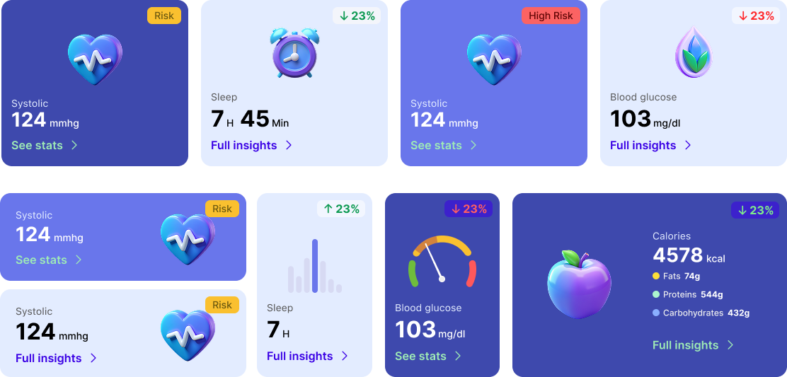
We created a clean, accessible dashboard that highlights key health metrics in a simple, visual way. With customizable elements and a user-friendly layout, it helps users track and understand their progress with ease.
Core Problem & Solution
🧩 Core Problem
People living with type 2 diabetes often face challenges when trying to make sense of their health data. Existing apps can feel cluttered, overly clinical, or too technical — making it hard to stay motivated and see progress clearly.
💡Our Solution
We created a clean, accessible dashboard that highlights key health metrics in a simple, visual way. With customizable elements and a user-friendly layout, it helps users track and understand their progress with ease.
Core Problem & Solution
🧩 Core Problem
People living with type 2 diabetes often face challenges when trying to make sense of their health data. Existing apps can feel cluttered, overly clinical, or too technical — making it hard to stay motivated and see progress clearly.
💡 Our Solution
We created a clean, accessible dashboard that highlights key health metrics in a simple, visual way. With customizable elements and a user-friendly layout, it helps users track and understand their progress with ease.
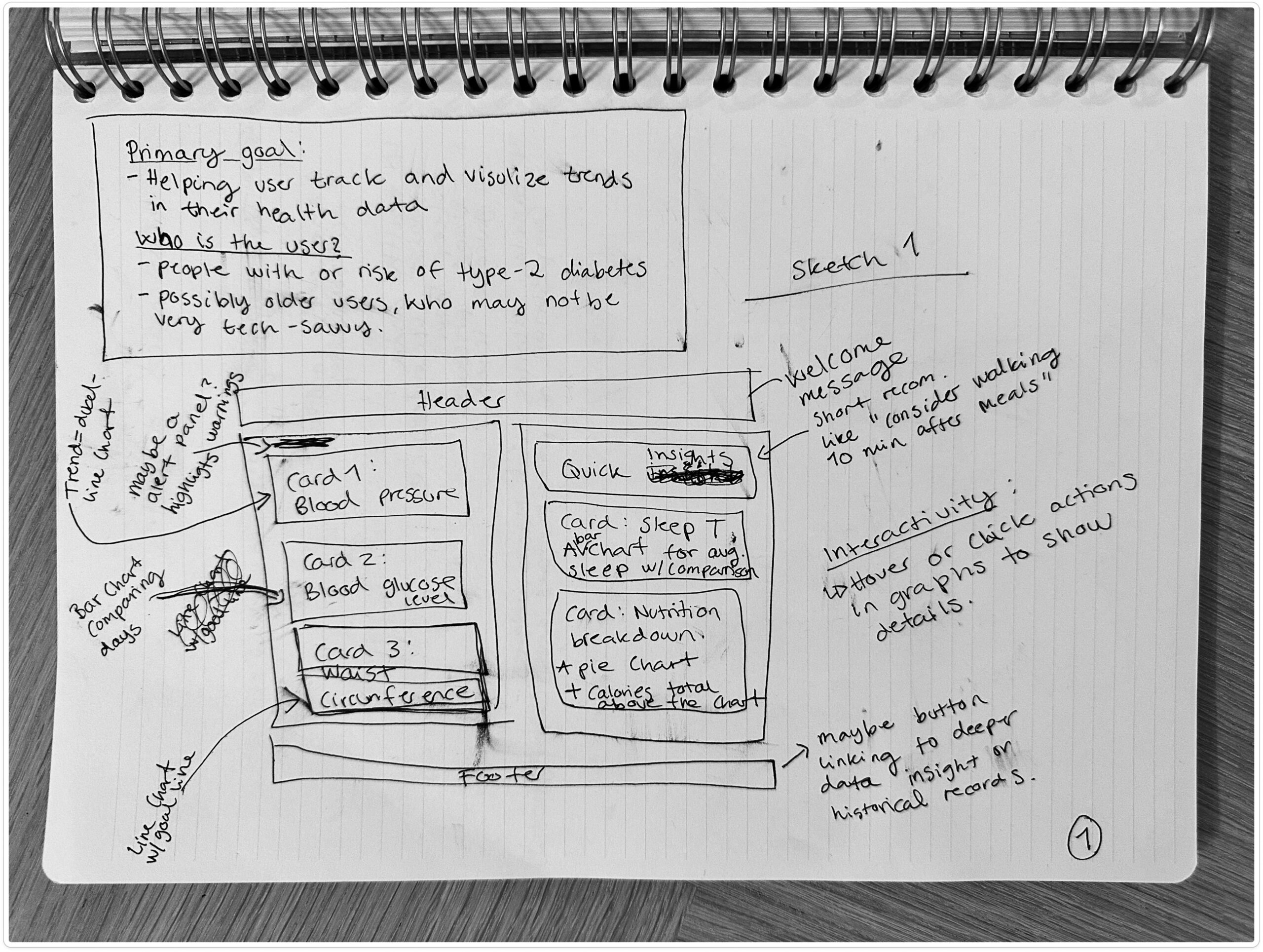
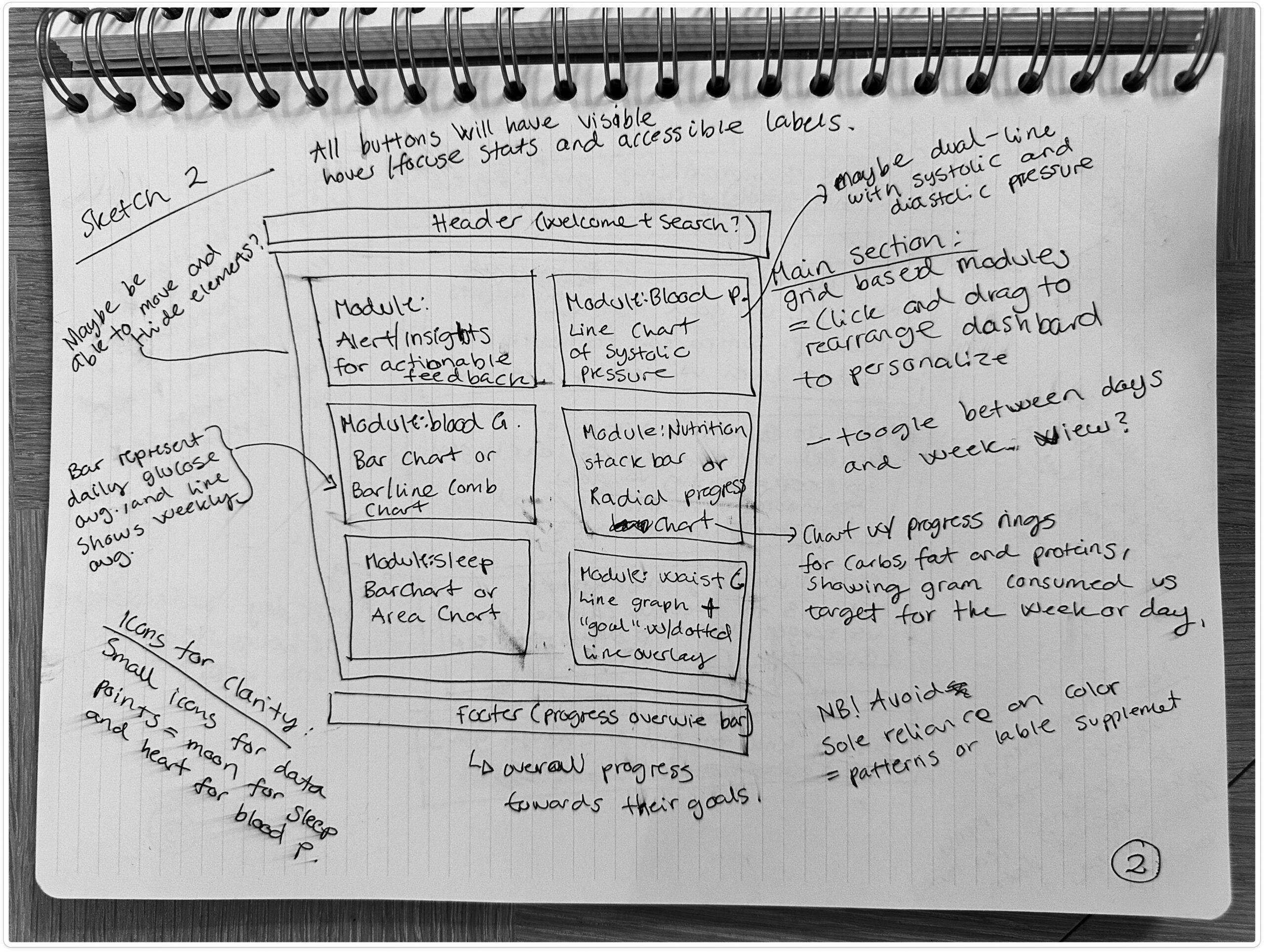
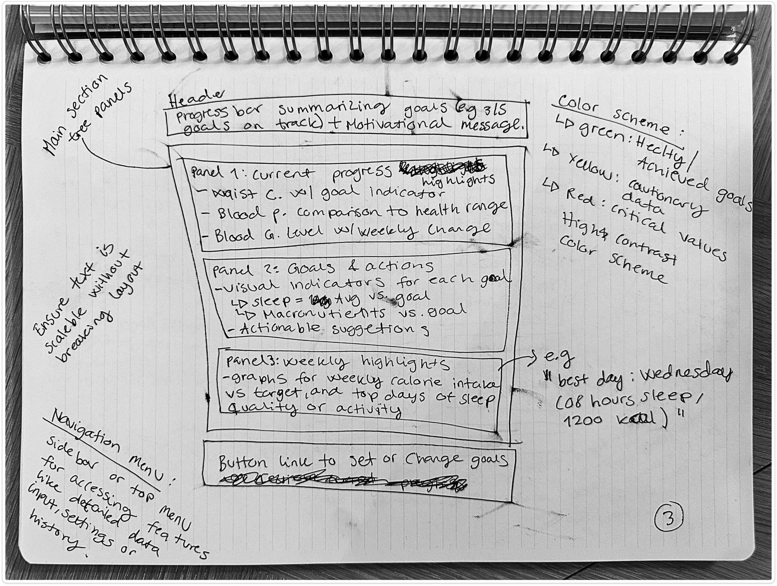
1. Sketching & Research
We began by brainstorming and sketching initial ideas, combined with competitive analysis to understand user needs and opportunities.
1. Sketching & Research
We began by brainstorming and sketching initial ideas, combined with competitive analysis to understand user needs and opportunities.
1. Sketching & Research
We began by brainstorming and sketching initial ideas, combined with competitive analysis to understand user needs and opportunities.
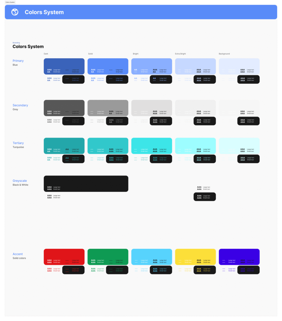
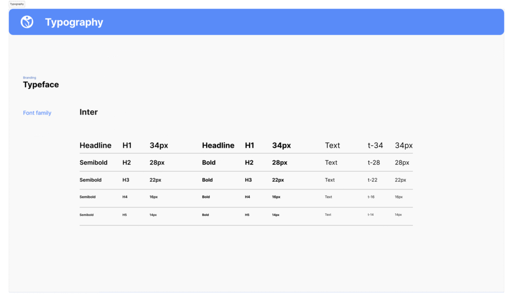
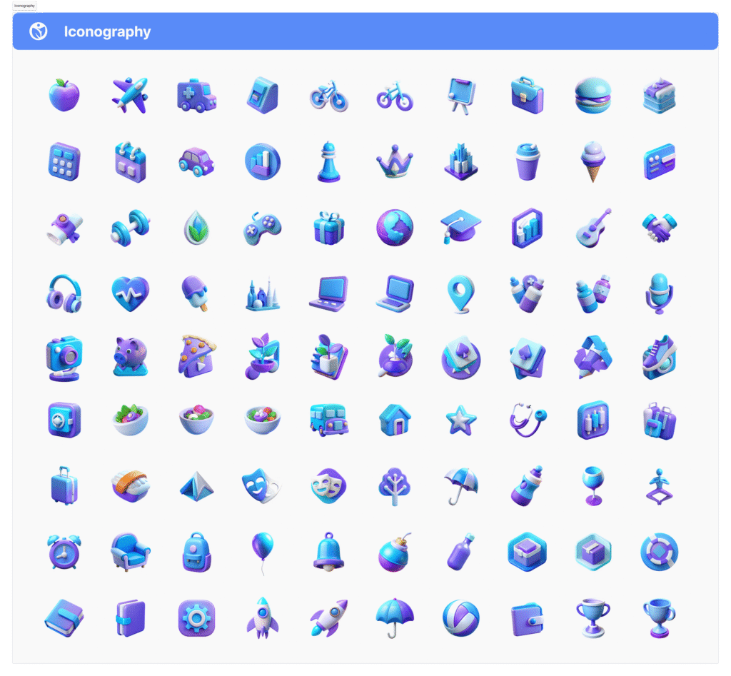
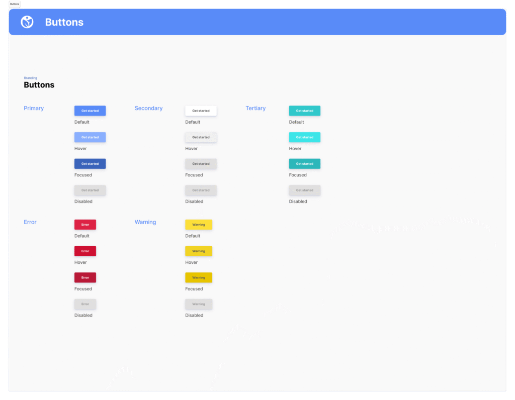
2. Design System - Look & Feel
We focused on accessibility and clarity, developing a visual language with legible fonts, high-contrast colors, and consistent UI elements documented in a design system.
2. Design System -
Look & Feel
We focused on accessibility and clarity, developing a visual language with legible fonts, high-contrast colors, and consistent UI elements documented in a design system.
2. Design System -
Look & Feel
We focused on accessibility and clarity, developing a visual language with legible fonts, high-contrast colors, and consistent UI elements documented in a design system.
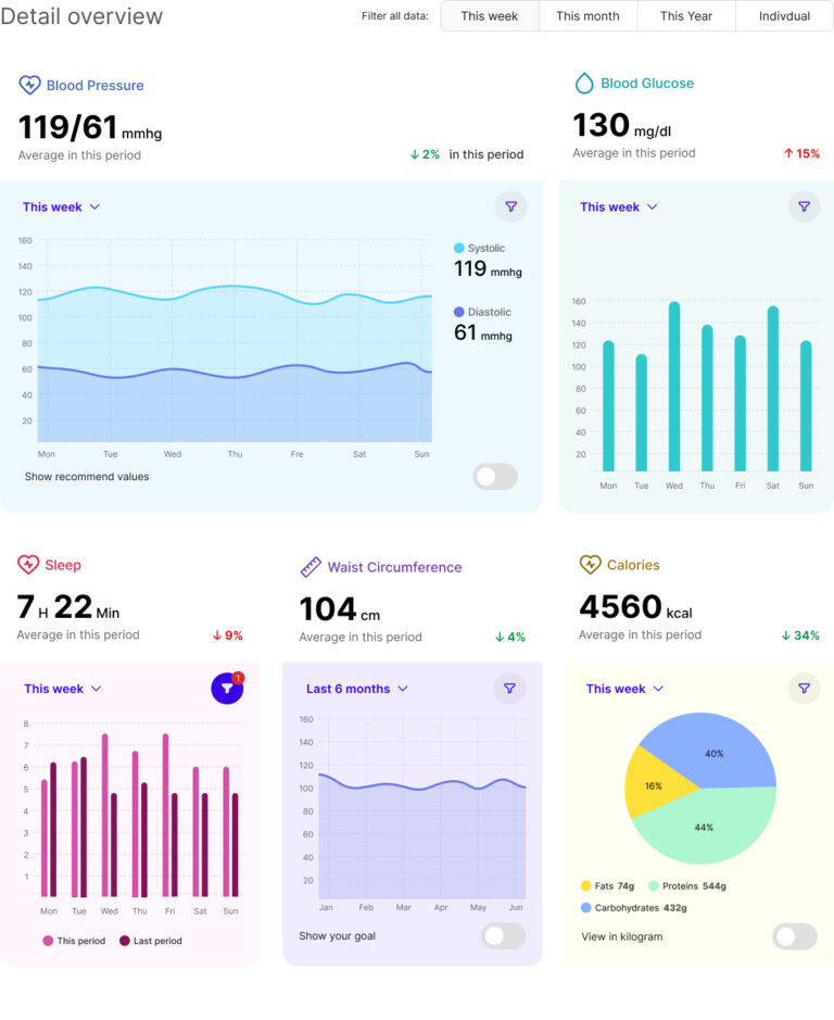
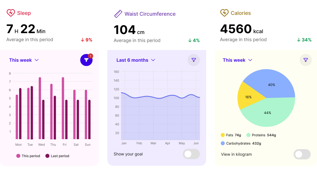
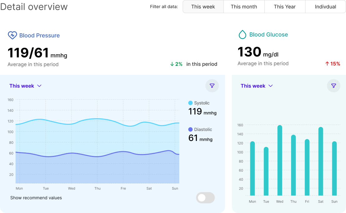
3. Digital Sketches
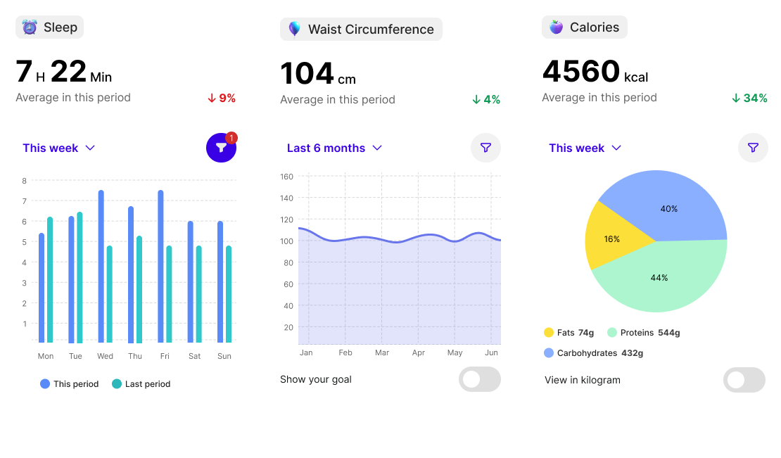
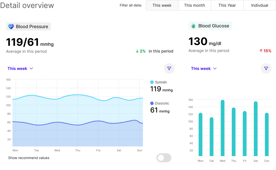
Wireframes helped test layouts and data visualizations early on, forming the foundation for a structured, user-friendly interface.
3. Digital Sketches
Wireframes helped test layouts and data visualizations early on, forming the foundation for a structured, user-friendly interface.
3. Digital Sketches
Wireframes helped test layouts and data visualizations early on, forming the foundation for a structured, user-friendly interface.
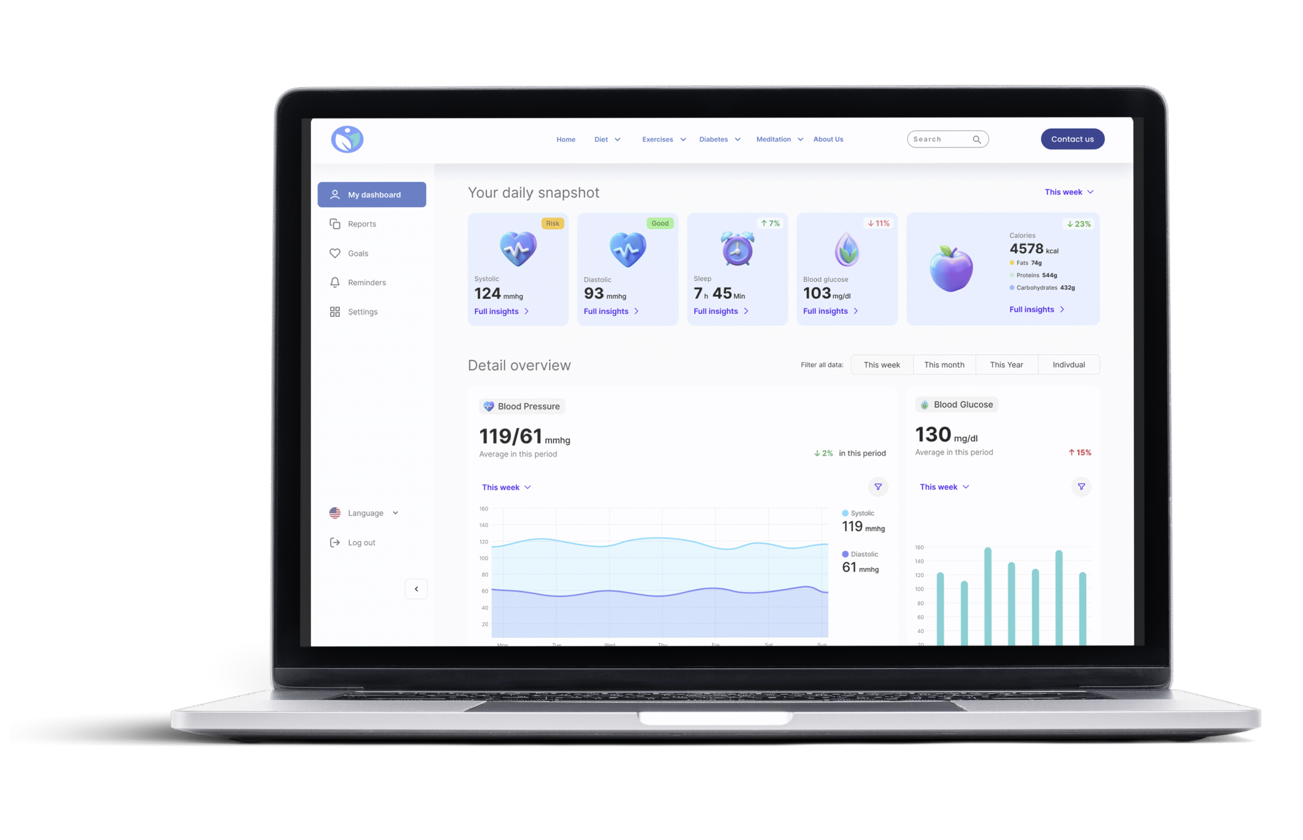
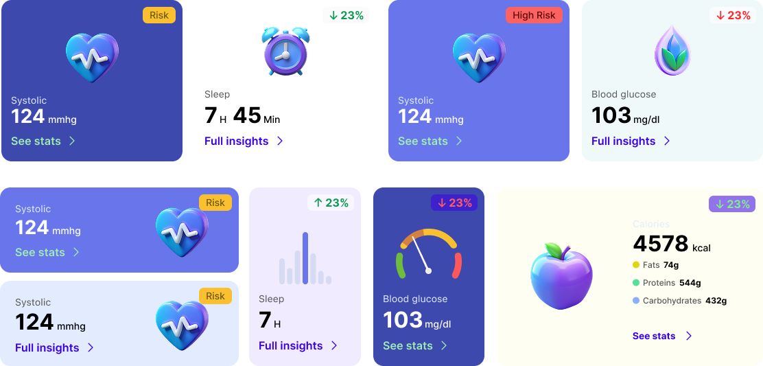
4. Prototyping
We built interactive prototypes to test chart functionality, usability, and accessibility, refining the design based on user needs.
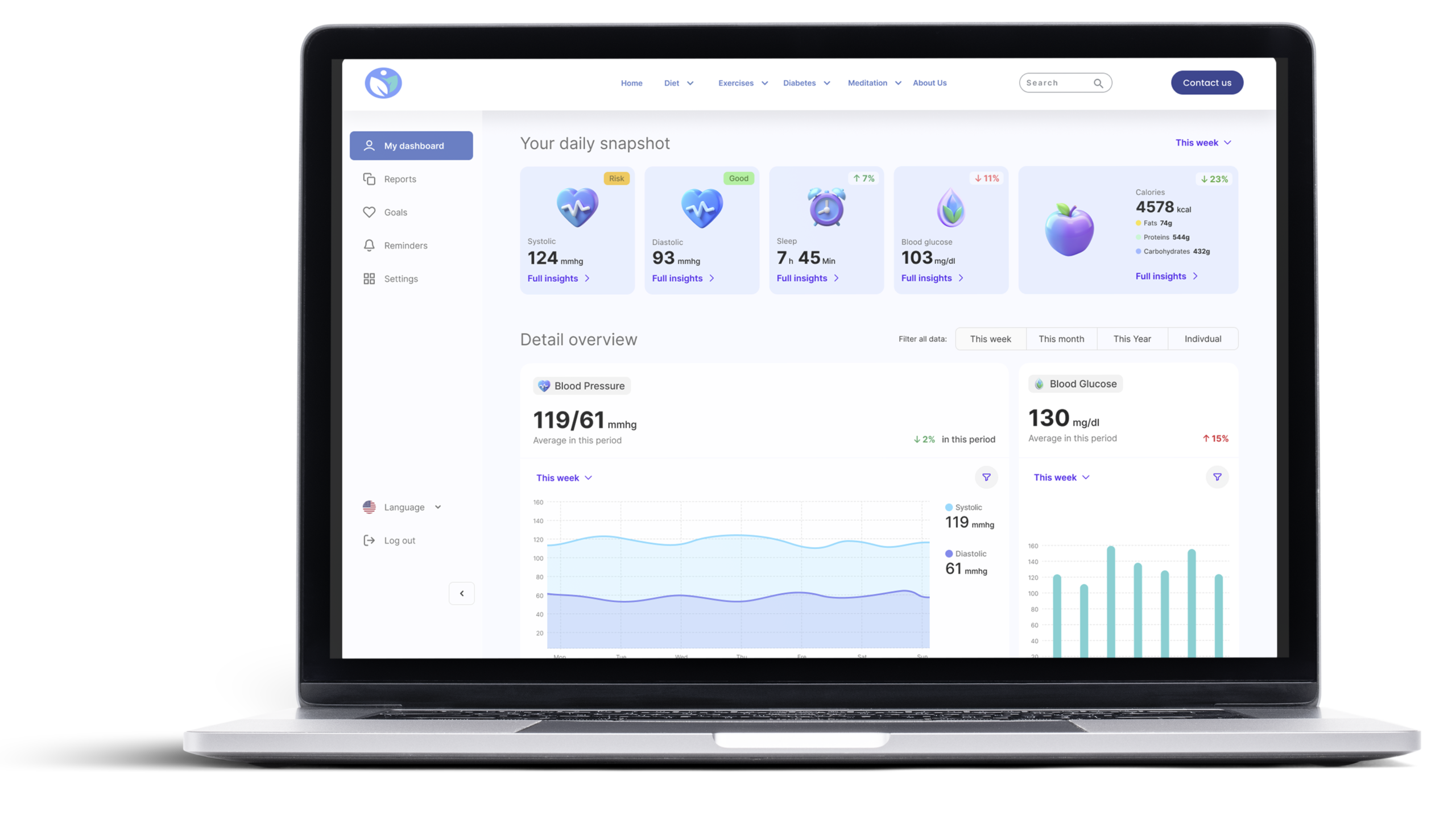
Our dashboard prioritizes clarity, accessibility, and user needs. With a clear visual hierarchy, intuitive interactions, and customizable features, it offers a simple, inclusive, and effective way to support users in managing their health.
5. Conclusion
Our dashboard prioritizes clarity, accessibility, and user needs. With a clear visual hierarchy, intuitive interactions, and customizable features, it offers a simple, inclusive, and effective way to support users in managing their health.
5. Conclusion
Our dashboard prioritizes clarity, accessibility, and user needs. With a clear visual hierarchy, intuitive interactions, and customizable features, it offers a simple, inclusive, and effective way to support users in managing their health.